November 24, 2025
Will AI make us smarter or dumber? The insights of Klöpping, Scherder and Online Dialogue
Reflection on Klöpping × Scherder by Simon Buil (Data Analyst at Online Dialogue)
Kom bij ons werken. We zoeken een Data-analist! Bekijk de vacature
In the field of CRO, we see in A/B testing a clear connection between the time on page and conversion rate. Among other things, the position of a call-to-action (CTA) makes a big contribution when it comes to how quickly users complete a specific task. User experience (UX), in particular, is about curbing the amount of clicks. Therefore, the ease and speed of completing a specific task is very decisive for a good user experience and satisfaction. In addition to position, size, color and text are also important features for the success of a good CTA.
Below I provide some tips on which key places to place a CTA for the sake of conversion and providing the best user experience.
What you want to achieve is for your user to interact without scrolling with the CTA that yields conversion or is a next step in your funnel. So what should be avoided is that the CTA is below the fold and not visible to the user.
As a designer, consider different devices and screen sizes. A button that is easily visible on desktop may just disappear on mobile.
Much research has been done on user image directions on a Web site. From one such study, the Gutenberg Diagram emerged. This diagram is divided into quadrants.
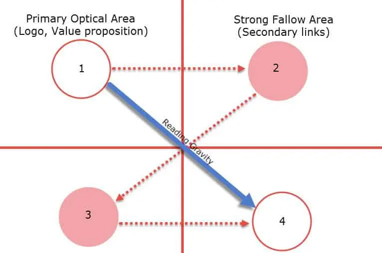
If you look closely at the diagram, you can see that the top left and right have an important hotspot is. It is then seen that the user's eyes move from the top right to the bottom left and then come out the bottom right. A user's gaze direction is shaped like a letter ‘Z.
Since upper left and upper right are the first places the user looks, it is convenient to place a CTA there.

One of our clients that applies this well is Effectory. In the image above, you can clearly see that all the primary information is on the top left, such as the logo and navigation items. To its right is the main CTA (request a demo). Then, using the bottom information, the user can go to the desired product.
For example, on a product overview page or product detail page it makes sense that people would want to orient themselves first. If the CTA is exclusively at the top of the page, the CTA will no longer be visible the moment the user scrolls below the fold. Therefore, in addition to a CTA at the top of the page, it is also desirable to place a CTA in the middle of the page. Below is an example of applying a CTA in the middle of the page.

Although research has shown that only 67% of users scroll on websites, it is important to place a clear CTA at the bottom of the page as well. Obviously, the CTA placed at that position should match the user's need. If one has ended up at the bottom of the page, the user may not have found the desired content. One option that can be offered is to place a form. The user can then request information about the service or product in question. Below you can see how Effectory handled this. A nice optimization to test on this form, is only request information needed to contact the user. This reduces the number of input fields and will make it more likely that the user will submit the form.

Although the percentage of users who reach the footer is relatively small, a CTA can also be placed there in the footer. In most cases, the footer is the same everywhere, so it will be present on every page.
At the footer you can choose to place a secondary CTA. For a secondary CTA, you can think of; newsletter signups, social media integrations, app downloads, etc..

In this blog, you were able to read about the ‘smart’ places to position your CTA. CTAs are not only important at the top of the page, but also in the middle and in the footer. Of course, because of the user's scrolling behavior, there is a certain prioritization/urgent. Therefore, it is important to place a clear CTA above the fold so that it is always in view. It is useful and very instructive to test different CTAs in A/B testing. That way you can find out what works best for your website.
Want to know how to improve UX through UX writing? And how to come up with good copy for in your CTAs? Also read my blog on UX writing. In it I explain how you can increase your conversion rate using small copy changes.
