
24 November 2025
Worden we slimmer of juist dommer door AI? De inzichten van Klöpping, Scherder en Online Dialogue
Reflectie op Klöpping × Scherder door Simon Buil (Data-analist bij Online Dialogue)
The baker around the corner used to know exactly what time his customers came by, who bought which bread, how the neighbor was doing, on which days you had visitors and why you hadn't come to get bread the week before. According to Roy Schieving (data-driven design doctor at Online Dialogue), knowing who your customers are and how they behave is indispensable in perfecting the dialogue between the customer and the salesperson. This applies to offline dialogue as well as online dialogue. But how do you get to know your customers if you don't speak to them every Saturday morning?
According to Roy, the answer lies with A/B testing: essentially a social experiment where one or more variations on a page are randomly shown to Web site visitors and statistical analysis is used to determine which variation performs better for a particular conversion goal (e.g., subscribing to a newsletter).
For his work as a designer, Roy combines data analysis techniques with psychological knowledge to understand the behavior of website visitors. In an interview, I asked him about the added value of this unique combination in Conversion Optimization and how it is applied in practice.
You call yourself a data-driven designer, could you explain what that means and what makes you different from, say, a front-end designer?
What makes me different is that I can interpret data and, in addition, I can apply a bit of psychology to my designs. You see a lot of designers who purely want to make something beautiful instead of something that works better. So I am also able to occasionally just make ugly things that stand out. And therein lies my strength. I look at what is more profitable in the long run.
A/B testing is something that is already used regularly in online marketing, but is often underestimated. Do you encounter it a lot?
Yes, often you hear people talk about A/B testing, but when you see how often it goes wrong you suddenly see how few people really know anything about it. There are so many different things you have to consider and have knowledge about. That's also why we always work in a team on an assignment. That team consists of a designer, a data analyst, a psychologist and a project lead who coordinates everything. And I am the link between design and realization.
In your opinion, how important is that combination of design, psychology and data analysis in A/B testing?
We always say ‘measuring is knowing. To get to know a company's customers, you need to know how they behave on your site, and that's where A/B testing comes in handy. But you also need to know exactly where people get stuck and how people make decisions in order to know where and what to test and in addition, you need to be sure the tests are valid.
When we begin an assignment, the first thing the data analyst always does is to look for striking patterns in the data. For example, customers may get stuck at a certain point in a site. From that point on, the psychologist takes over and investigates what part of our brain is being addressed at the point indicated by the data analyst. We base this on the psychology of Daniel Kahneman which shows that human thinking can be divided into two parts: the irrational/emotional part (System 1) and our rational part (System 2). System 1 is the more developed of the two systems and often consists of an automatic response to an event while System 2 is much slower and often takes a lot of effort to use.
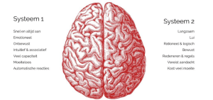
Figure 1: Overview of the different properties of system 1 and system 2 thinking, as proven by Daniel Kahneman.
Once it's clear which part of our brain is being addressed we'll start looking at how we can improve the design so that visitors can make a choice more easily. Once that is clear I get to work on a design and we can start testing to see if people actually exhibit that behavior or if we are on the wrong track. We often do that with one or two tests. And if it turns out we're on the wrong track then we have to switch to a different idea. That's why you're often not done with one test on one page. For that, you just need multiple iterations if you want to figure out how to entice customers to make a certain choice.
Could you make that concrete with an example?
One of our clients is Eurail.com. A company that sells rail passes that allow travelers from around the world to discover up to 28 European countries with one rail pass. The Eurail pass is a comprehensive product with many different options; for example, a traveler can choose to discover all of Europe with just one pass or choose a pass where they can discover 1 to 4 countries. In addition, the customer has to make a choice for how long the pass should be valid and how many days they want to use the train. To best guide the customer in making the right choice, we were asked to improve the site to make it clearer for travelers which products they need.
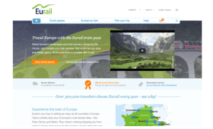
Figure 2: The original design of the homepage
To make the choice easier for their customers, we created a new design for the homepage. First, all unnecessary distractions such as a video and multiple buttons were removed and replaced with a roadmap containing the 3 choices people need to make before buying a Railpass. This change alone resulted in 400x more ‘clicks. But after that, it stopped. So we were very good at enticing people to click through with this design but once they got to the product page they didn't know what to do and got anxious about all the choices. So we ran a second test.

Figure 3: Design 1, gives site visitors an overview of the various choices they have to make so they have a chance to think about them.
For the second design, we chose to bring the products more forward, to let people see the different options earlier. Also, the Call To Action button that got an incredible number of clicks during the first test made less noticeable. Instead of clicking the button, people now click on the products. As a result, people are already making a choice on the homepage, creating fewer distractions in the further stages of the buying process.

Figure 4: Design 2, gives site visitors information about the three different products already on the home page.
To find out exactly where the problem was you had to run two tests in this case, how many tests on average are needed to properly help a customer?
It really differs per customer and per page. In the conversion tunnel, for example, you already see very different behavior than on a homepage. Then you often end up with a large number of tests. If you have a bit of a large website, you can easily end up with 100/150 tests.
And then how long does a test run?
Data analysts calculate that by looking in advance at how many visitors are on a page, how many people click through and how many (final) conversions there are. Those numbers are the input to an algorithm that calculates how many weeks an A/B test should run. But we always calculate in weeks anyway since visitor traffic on Monday morning is vastly different from visitor traffic on Sunday evening, for example. That's why we always want to measure the week effect. So we measure at least a week and because we track everything using cookies we measure a maximum of 4 weeks. This is because cookies often expire after four weeks, or people throw them away. And if you throw away your cookie, then you come back into the tests as a new visitor and that contamination should not be too great.
So basically what your approach comes down to is applying knowledge of psychology to get website visitors to exhibit a certain behavior at the right times with the right triggers. For some people, that can feel like they're being directed without actually wanting to be. Where do you think that ethical boundary lies?
I think you can tempt people, but not mislead them. I don't think you can make people interpret texts the wrong way or make text so small that people read over it. I think that's a line you shouldn't cross. You should always share the right product information. After all, you also want visitors to a site to keep coming back. That is often even more important than purely increasing the conversion rate. Misleading is often easier than seducing. So we take that very much into account, we actually optimize a site in such a way that the experience for the visitor improves, so that the site becomes easier to use.
You have a fairly unique approach compared to other companies in your industry by combining design, psychology and data analysis. How do you convince your clients of the added value of this approach?
Usually marketing managers themselves are already all lyrical about psychology. But CEOs are often a bit harder to convince. Sometimes they just don't find it necessary. And we have often demonstrated things to clients who then indicate that it is not possible that those findings are true. You can prove it so many times, but they remain convinced that they are right.
What questions do companies often come to you with?
The customer may ask for more newsletter subscriptions, but ultimately - at least for commercial companies - it's about increasing sales. That may be to get more conversions from an existing customer base, or it may be to increase order value, so the customer spends a little more than he or she normally would. But we also try to teach companies how to look at their data in the right way themselves.
Websites often come in all shapes and sizes. How much does the quality of a site affect your work?
We once had a client where we recommended that they give the website a redesign first. After that, we would then take over. If the website is really bad, then you can start optimizing but that doesn't make much sense. Then you achieve more by starting over. In addition, your system must also have a certain speed and be equipped with the latest technology if you want to test properly. So the quality of a site certainly does affect our work.
You just mentioned that sometimes people don't believe the results of your tests. Is it also sometimes the case that things go wrong or that there is a false-positive, for example?
In another test for Eurail, we had chosen to add a new button on the product page with the goal of ensuring that people are more sure of their choice before making a purchase. The button asked the question, ‘How many travel days do I need? But after four weeks of testing, it showed that there were far fewer conversions. Before you start a test you sometimes predict something, what could go right or wrong, but we didn't expect that effect. The question the button asked was not a very shocking question; after all, it was the most frequently asked question in customer service. Why would that question scare people all at once? Then it finally turned out that there was a technical glitch when people clicked the button that caused many of the links on the site to stop working. So things like that can happen, too.
Where do you think the future of A/B testing lies?
I think we're going to work a lot more with Machine Learning. But we are still very far from that. There are companies that are already working on it, but I don't think it's being used much yet. I also think that it is still mainly reserved for the really big companies because of the costs, i.e. for Booking.com, Google and Amazon. I also don't think that just anyone has the knowledge to work with it properly. I think there is also a step in between. For example, there is still much to be gained in A/B testing of apps. This is now little allowed by Apple and Google, but if you see how many fewer desktop users there are and how fast the number of mobile users is rising, I see a lot of potential there.
In what ways does that shift affect A/B testing?
Anyway, conversion rates are much lower on mobile. So for example, if a website has 5% conversion rate. Then the tablet has 3%, and mobile is often between 0.5 and 1%. But you do see that traffic is increasing on mobile. Less and less people have laptops and computers, and more and more people have tablets. In addition, of course, we use our fingers instead of a mouse or a keyboard. And that's also quite a learning curve that we're going to have to deal with a lot in the future.