
November 24, 2025
Will AI make us smarter or dumber? The insights of Klöpping, Scherder and Online Dialogue
Reflection on Klöpping × Scherder by Simon Buil (Data Analyst at Online Dialogue)
The use of Adobe Analytics is a rather underexposed subject in a world dominated in particular by the position of Google Analytics. This in itself is not surprising because Adobe Analytics is a paid solution that is particularly aimed at and used by companies of a certain size and where the analytics and optimization level is often on another level.
For years there was discussion about the user-friendliness of analytics tools. Google Analytics was always praised for its intuitive and fast interface so the use of Adobe Analytics (formerly called Omniture SiteCatalyst) was regularly perceived as less user-friendly.
In 2009, the American Adobe Systems acquired the company Omniture (maker of SiteCatalyst, among others) for the astronomical sum of $1.8 billion. Adobe took it under its wing back in 2011 but did not say goodbye to the name ‘Omniture’ for good until 2012 and the tool with the new name “Adobe Analytics” became part of Adobe's Marketing Cloud.
Without wishing to get into an “iOS vs Android” type of discussion about which is better, Adobe, with the introduction of Analytics Workspace this discussion is completely settled as far as I am concerned. In September 2015, Analytics Workspace came out public beta and was fully integrated into Adobe Analytics. The operation took some getting used to at first but anno 2018 we can now conclude, “It's works like a breeze!”.
For a long time, it didn't look like Adobe was listening to their users properly, and development even seemed a bit behind the competition. Until suddenly Analytics Workspace saw the light of day. Then it turned out that Adobe had listened carefully to users“ experiences after all, but had probably thought hard themselves about what the most ideal ”workspace" for a web analyst should look like. One that is not only fast and efficient, but also works as an environment where, as a true data creative, you can get to a fully developed idea via a sketch pretty quickly.
Drag and drop your dimensions and metrics to a so-called freeform table within Workspace and you can put together a report or dashboard with all sorts of fancy visualizations in no time. It can all be done with and in the same interface. No more switching between different reports (with long page load times) where you have to add reports to a dashboard one by one. Nope, that's all over.
In 3 years, Workspace has become the core functionality of Adobe Analytics. Nor will it be long before the old reports are all a thing of the past. Hooray!
There is a lot to be said about Workspace's capabilities. Below I like to share my 10 personal tips for working with the Freeform table within Analytics Workspace. Perhaps it will help you again to improve your own workflow.
Always be optimizing 🙂
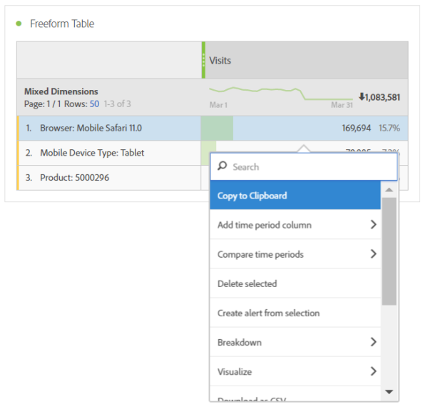
By selecting different dimensions (e.g., a value for browser, mobile device type and a product), you can mix the three and show them as one result in a table or graph. If necessary, adjust the name to make everything even more readable. This option also has the possibility to add the values per row up to 100% (as in the example below) or to calculate this from the total (in this case the total number of ‘visits’).

Since the release of February this year, a “copy to clipboard” option has finally been added that allows you to copy cell and table contents very easily. This has probably fulfilled a long-held wish of many Workspace users. Copying already worked (via copy/paste) but more often didn't work than it did. Exporting data to a CSV file is now also a possibility.
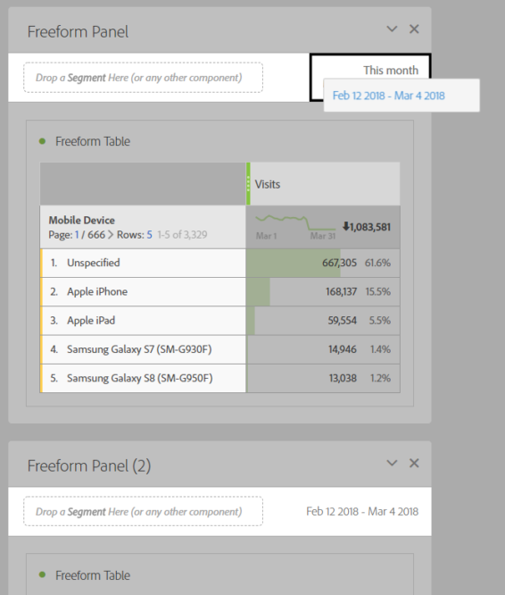
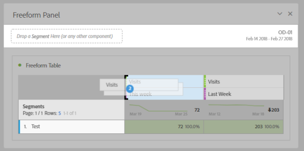
If you work in Workspace on an analysis with different panels, then you probably also often work with the same periods. If you want to change a period in a new panel, you can drag the date from one panel to another. Using the date range as a segment also works but then the date (to the right) does not change with it.
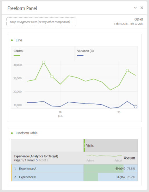
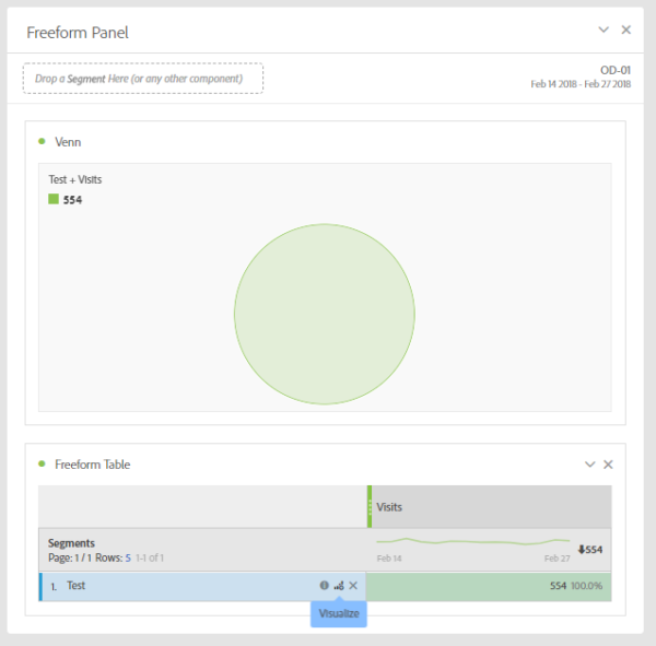
For analyzing a fixed duration (e.g. of an A/B test), it can be convenient to work with fixed periods. To do this, create a “custom date range” and select a start and end date. In the example below, the “date range” has been given the name of the A/B test (OD-01).
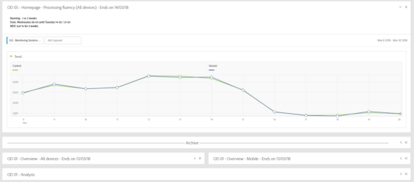
You can also use Workspace to keep track of the total number of A/B tests you run. Duplicating panels and the small adjustments you need to make for each new A/B test have become a piece of cake. Also, create a “fake” panel and post below in an “archive” the collapsed panels of A/B tests that have ended and been analyzed. Also keep the panels of A/B test results and post-analysis together. That way you or another analyst can always find everything again quickly.
When you have selected a segment and a metric in a Freefrom table and click on the visual icon, the data within this segment is not shown as a trend line by default but as a Venn diagram. I find this very inconvenient. However, there is a way to do this anyway. To do this, select the segment, right-click, and then choose “Line” under “Visualize”. Et voila!

The option to copy one or more metrics (or columns) simultaneously within the same table is really ideal. Very handy when e.g. you want to use the same metric more often but in combination with another segment or period.
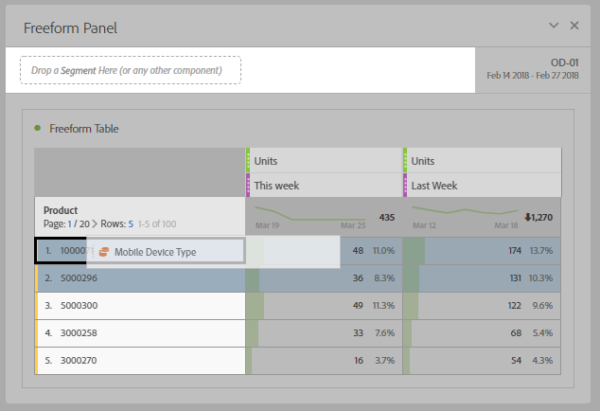
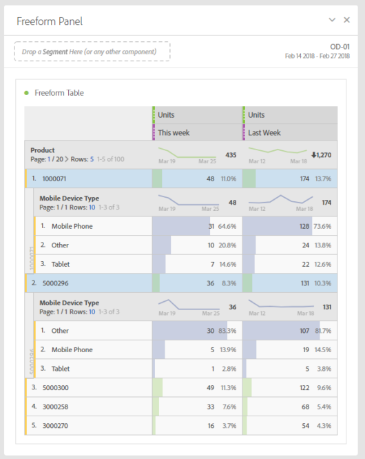
Want a break-down on multiple dimensions simultaneously? Within Freeform, this is very easy. Select the rows in the table and drag the desired dimension onto the selection. The result is that only the selected rows show a break-down. There are now multiple options available here (under the right mouse button) to collapse/unfold or remove all break-downs that are there at once.
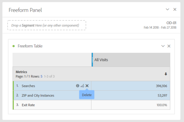
When you have selected a number of metrics in a Freeform table, it is possible to quickly remove several metrics from the table by selecting them row by row (do not have to be contiguous) and then clicking the cross (“delete”). The selection will be removed in its entirety.
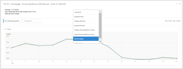
It is often very useful to provide a description to a panel. Think for example of an explanation of the result of an A/B test or an online campaign. Adding a description can be done on the panel itself (via the right mouse button) by choosing “edit description”. Through this option the same formatting options are available as through the Text visualization.
Considerable thought was given not only to simplicity of use but also to simplicity of transfer to the various users. It should be easy for them to get started with a Web site's data. The drag and drop interface is so intuitive that onboarding new users is also fairly quick. The amount of dimensions, metrics etc. available, on the other hand, can be quite overwhelming for the average user.
The solution to this is the “curation” option. As owner of a Workspace project you can add dimensions, metrics, segments and date ranges exclusively to a Workspace so that the recipient only gets to see those from the fully available list. This saves the user an unnecessarily long list of choices and keeps everything very clear as a result.
This article was published on March 22 at Webanalists.com